Laura Bruce Media
Monday, 4 April 2016
Tuesday, 22 March 2016
Evaluation- Question 4 part 4-How did you use new media technologies in the construction and research, planning and evaluation stages?
Photoshop

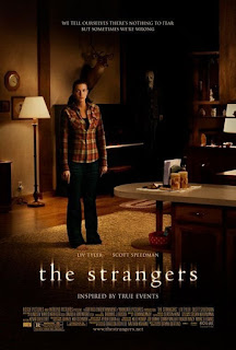
 Here is an example of how I manipulated an image on Photoshop. Below is my original image and the image I have created through manipulating it on Photoshop. First I cropped and zoomed in on the image to make the killer appear bigger. I wanted the image to appear darker so I went into effects on Photoshop and made the image a little bit darker. I also turned up certain colours such as the green in order to make this stand out more on the image. In the background I added a mist effect to make the image look more mysterious like there is fog in the distant. For the knife I wanted it to seem as though it had blood on it however this did not happen when the photo was originally taken. To give it this effect I added dark red dots to the image, on the end of the knife, to give it the allusion it had blood on it. When looking at existing posters I used "The Strangers" as my style model. I wanted the black faded effect on the edges of my poster. To do this I used the eraser tool and selected the colour to be black. I then reduced the opacity and selected the correct size eraser so that I didn't erase the whole image.

 Here is an example of how I manipulated an image on Photoshop. Below is my original image and the image I have created through manipulating it on Photoshop. First I cropped and zoomed in on the image to make the killer appear bigger. I wanted the image to appear darker so I went into effects on Photoshop and made the image a little bit darker. I also turned up certain colours such as the green in order to make this stand out more on the image. In the background I added a mist effect to make the image look more mysterious like there is fog in the distant. For the knife I wanted it to seem as though it had blood on it however this did not happen when the photo was originally taken. To give it this effect I added dark red dots to the image, on the end of the knife, to give it the allusion it had blood on it. When looking at existing posters I used "The Strangers" as my style model. I wanted the black faded effect on the edges of my poster. To do this I used the eraser tool and selected the colour to be black. I then reduced the opacity and selected the correct size eraser so that I didn't erase the whole image.
  |
| Original Image |
Thursday, 17 March 2016
Monday, 14 March 2016
Subscribe to:
Posts (Atom)


